How To Build a Great Organic Rank Tracking Dashboard
Are you looking to build a rank tracking dashboard? Something to monitor the SERPs and track your organic keywords either for you or a client?
We’re going to walk you through the process & decisions we used to make our basic rank tracking dashboard hopefully it will be helpful!
We're not going to dig into the practicalities in this post (e.g. SQL), we'll have future more technical ones for that.
Why listen to us? We're data warehouse specialists, we help SEO teams get all their data in one place, owned by them.

We use to create best in class reporting & help them perform better analysis and we've got years of experience doing it.
First off here’s a public version of the dashboard go take a look:
Rank Tracking DashboardAs with all our report teardowns, if you don’t want to build this and would just like your reporting created and maintained for you, please get in touch!
What do we want to cover?
Great hopefully you’ve seen the dashboard and had a play, thanks for not getting side-tracked.
We start with defining our scope, it’ll help us keep focused and make something useful. Go and talk with your audience and generate a question list. We ended up with:
What questions should a rank tracking dashboard answer?:
- How is my site performing?
- How is my site performing compared to before?
- How have the SERPs changed?
- How visible is domain?
- What SERP features exist on my SERP?
1 & 2 we definitely need. We went back and forth on 3-5 and ended up including them.
How do you pick the question list?
As a general rule for scoping a dashboard, go to your audience, get the list of common questions, structure them in terms of importance and then make cut offs based on time and audience.
Broadly we tried to include any very common questions SEO’s want from this data, without diving too deep into the weeds.
The audience for this report was your standard SEO consultant/analyst, if we were making an executive version of this dashboard, we’d be far more stringent about cutting it down.
Prefer a video?
If you'd like a video walkthrough of the dashboard, we've also got one. It covers most of the points of this blog post, although some of the more complex parts we had to put in text to keep the length manageable.
Page 1 & 2: Showing basic rank data intelligently
Getting a summary in first
A good general rule is:
- Present quick immediate summaries at the top.
- Present deeper more segmented data further down.
Then anyone can stop scrolling at any point and still have gained an insight.
Our quick summaries in this case are:
- A breakdown over time.
- Two short period comparisons over 7 & 28 days.
We’re two graphs in and we immediately have a couple decisions we needed to make.
Average rank needs to be partnered up
Whenever possible try and pair up average rank with something else like bucketed rank or keyword.
![]()
By itself average rank can be misleading.
- If you suddenly start ranking for keywords you're tracking and start at say position 20, it'll tank your average rank.
- A drop at higher ranks, usually matters more than a drop at lower ranks. Average rank will treat them the same.
Put it alongside bucketed rank and we immediately get more information about how rank has changed.
Top rank vs all rank
The next immediate question is top ranking URL vs all ranking URLs.
You might rank for a keyword with 1 URL, or with more than 1. So we might have multiple ranks.
Do we show all of them, or just the top rank?
If you’re displaying bucketed rank, then all ranks might be a better choice.
If you rank in position 2 & 3, that is valuable. You’ll get more clicks than just having 1 of them and if we only show the highest we lose that data.
![]() (Each bucket here counts the total number of URLs at this position)
(Each bucket here counts the total number of URLs at this position)
Because we’re showing bucketed rank with average rank, it’s really easy to count all of them and visualise it.
Making the first page fast
We want our dashboard to be quick.
Data Studio (or any BI tool) will get slower the more complex calculations you ask it to do.
To help speed up the first page for quick checks, we’ve done all the data calculation in advance and locked in the date range for page 1.
![]()
This means the entire thing can be prebuilt in advance and our dashboard is as fast as possible for complexity of data that needs to be shown.
You can’t do this with native connectors, but if you’re working off a warehouse (which is the only way we’ll do it) building a page with a fixed date range on a pre-cached can give you a lot of speed for anyone who just wants to quickly check in.
Which again we think is likely with this report.
Segmenting data with cross filtering
As we scroll down, now we want to dive deeper. First level of summary is done, time to segment.
The most useful segmentation here is one given to us by the user. In this case we’re using a primary ranking tag.
If there are multiple equally important segments we could just double up this section.
There might be too many tags to show on a graph (anything over 5 will be hard to read, particularly if one is a lot larger than the other), so instead we fixed period summary tables and make use of Looker (Data) Studios best feature…
Cross filtering.
![]()
It’s so good, it single handedly pulled me away from my love of the Excel pivot table. If all you take from this summary is "I should cross filter more" then I have succeeded.
You see what is interesting in the summary table, click on a segment and the entire dashboard filters so all the other charts, tables & widgets now use that data.
Cross filtering makes individual keywords shine
Cross filtering allows us a solution to the next problem.
SEO’s really want to see individual keyword rankings. But showing everything all at once, on the first page is most likely to be un-actionable or overwhelming.
But if we show it at the bottom after you’ve cross filtered the report, then you’ve got a far smaller set and now there’s a chance this will actually be valuable.
To take it one step further, you can then select an individual keyword and we’ve got a graph below which will be cross filtered to show you how the URLs change rank.
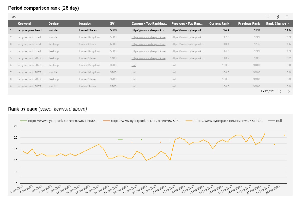
Cross filtering lets us show a manageable number of keywords to the user and then make the bottom graph readable and useful.
Which helps us fill in extra data which we can’t show in the table because we have to show top rank:
Time for top rank to shine
Looking at all the ranking keywords was great earlier, but coming to individual keyword level in a table, it suddenly stops being useful.
We want to show the change in rank for a single keyword, but if you have 2 URLs, there’s no easy way to display that.
We either have to average it or just show the top rank.
In this case we decided the top rank was more useful, because in the case you have a URL at position 2 & 18, this allows you to focus on the important one changing.
Changing periods
The second page, is almost a perfect repeat of page 1, but allows you to pick any date range.
It can’t be quite as fast as page 1 (although it’s still a lot faster than connectors), but you will sometimes need a larger date range.
Sidebar: The filters
Non date filters
Each page has a large chunk of filters at the top.
![]()
Cross filtering is brilliant for dynamically digging through the data, but in some cases you only care about a specific scenario e.g.:
- Only want to see UK tracking.
- Only care SERPs where the ranking URL has changed.
- Only care about branded search terms.
In that case the easiest thing to do is to have a filter. For any scenarios where a user might want to focus on a specific area we’d recommend putting filters on your dashboard.
We put all the filters which apply to the entire dashboard (most of them) at the top.
Date filters
Looker (Data) Studio’s, default date comparison is not the best.
It only shows percentage change by default and it’s a relative percentage change.
If you want anything else e.g.:
- Absolute numbers
- Percentage of total change (ignoring filters)
![]() For example with rank we really want to show exact rank change, not a percentage.
For example with rank we really want to show exact rank change, not a percentage.
And we do - you have to do some work arounds.
What is this workaround? Essentially this means filtering the data to two periods, labelling them as current and previous and the comparing them. We have to handle the period comparison data logic.
You can accomplish this with blends or in SQL.
We’ll probably make a separate blog post about this at some point as it’s complicated and this post is already long.
Page 3: Visibility
How do you calculate visibility?
Visibility is a super useful metric that which essentially tries to help you prioritised rank, without exposing you to seasonality.
Search volume * CTR * rank
We’re gonna do a full post explaining all the different things you can do with this to make it better.
One easy thing we’re doing to improve this, is rather than using the default search volume numbers from Google, we can use a search volume from a third party provider like Ahrefs, SEMRush or Moz who have tried to fix some of the problems the default Adwords search volumes have.
How do you estimate visibility for all the different features?
SERPS are full of rich features which either don’t have a primary URL or have lots of elements which lead off to other Google properties E.g. hotel pack.
You can get really complex here with how you deal with this. But what’s most important really here is that you’re consistent.
The point of visibility is to take rank (a metric that doesn’t really suffer from seasonality) and provide it some weighting so all the keywords aren’t equal.
We’ve taken a relatively simple tack.
![]()
- If a SERP element has a primary URL we give that position all of the visibility.
- If a SERP element has multiple primary URL elements which are directly visible on the SERP (e.g. a local pack) we take the visibility for the position and split it equally amongst all the elements.
- Otherwise we take all that visibility and label it no domain.
This definitely isn’t perfect (and the joy of data warehousing is being able to go back and retroactively improve things),
Plotting visibility on graphs
There are two problems here, both to do with scale.
![]()
- If you have big search volume terms they can dominate visibility. Brand terms are particularly a problem, because if you have a popular enough brand they can dominate and make it difficult to track the other results.
- What do you do if one competitor or domain is far bigger than the others and makes the graphs harder to eyeball?
In both cases the answer is to filter and segment. Either make multiple graphs or provide filters so a segment doesn’t dominate the results.
In this case we’ve done the latter. By default “No Domain SERP visibility” is toggled off, which our “no domain” SERP instances are ruled out and we’ve provided a brand filter at the top of the page which you could leave on a default value of non-branded if it was an issue.
Page 4: SERP Features
Segmenting SERP features
Similar to before, we start with a summary chart and then immediately move onto tables to allow you to segment.
SERP features can change a lot across device, country and keyword so in this case we show all the different segments at once and allow you to cross filter to explore them.
Showing average rank of SERP features
Once you’ve cross filtered the chart we then show you the breakdown at individual keyword level with the average rank.
You can get the images SERP feature at the top of the SERP or buried on page 2. In order to properly understand how important a SERP feature is, you need to see the average rank to understand how important this intent is.
Page 5: Compare 2 days
This page might be a little harder to re-create, because it requires you to have the full SERP data.
![]()
We’ve created this page using Data For SEO (a SERP API we’d highly recommend) and it means we’ve got access to the entire SERP.
When you compare rank data if you’re comparing any more than 2 individual days with top ranks, you start having to show averages.
But there is a whole rich SERP picture which might be insightful as to why things have changed as well as visually illustrative for the team.
This particular page requires you to select 2 days, pick a specific keyword and then it shows the entire SERP for those 2 days and how it’s changed.
It’s sometimes exactly what you need to see as SEO trying to debug ranking changes. What has happened to the SERP?
If you do have access to full SERP data, we’d highly recommend this sort of page, but it is definitely a harder one to make.
Page 6: Device and country
Bonus information at the back
This page is for a less common use case. These comparisons aren’t going to be looked at often, but they might provide useful context for looking at the macro picture of ranking.
Ancillary information like this should be at the end of a report/dashboard. You can come and engage with it if you’d like, but you don’t have to.
Comparing across dimensions
Up until this point all our comparisons have been across time.
i.e. period 1 vs period 2.
And then we focus in on a segment.
But we do also briefly want to look at comparison across dimensions.
This is often a page that gets customised to monitor comparisons across specific dimensions that a customer is worried about.
You can see some basic examples here, country & device.
Summary
What did we learn?
- Summaries first, then segment.
- Cross filtering is Data Studios single best feature. Please use it more.
- It prevents you from having to repeat dashboard elements.
- It lets you provide granular data while still keeping it useful.
- Rank as a metric has some intricacies to it and often best overcome by showing different versions near each other.
- Visibility can be complex, but the most important thing is consistency.
- Pre-building data helps makes reports fast.
- If you can get access to an entire SERP it allows you to let your users dig a lot deeper.
- Rank is important context for SERP features.
- Put the less important information at the back
Hopefully this has been useful for setting up your own dashboards.
If you’re interested having somebody else do this for you or want to have this template for your site please get in touch!
We help SEO teams get all their data in one place and get more from it.