Free SEO Looker Studio Dashboards + Setup Guide
Reporting (properly) on SEO can be quite complicated.
You can’t just give the same report to everyone and you can be sure your CEO doesn’t want to see the same thing as a small site owner.
But what if you don’t know where to start? Sometimes you need inspiration, a place to grow from.
We’ve got two different free templates for you. You can view them here, have a play around and decide if they're for you.
If they are, then we've got proper set-up instructions in our free resource library which you'll need to get them going:
The Search Console is a newer and has a couple more bells and whistles (we’ve gotten more ambitious!), so let's talk about what they do.
What can you do with them?
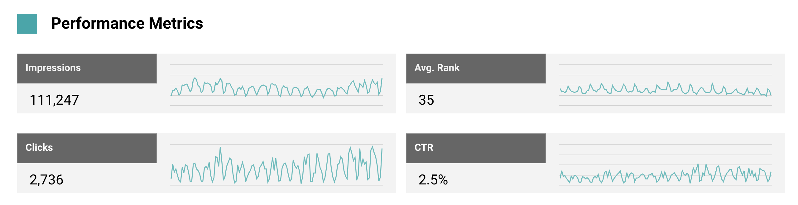
Search Console Report
The Search Console interface does a good job of answering basic questions, but it’s made for everyone and that means it can’t be too complicated.
The next step for most people is building their own dashboard. Somewhere to better report, analyse data and work from.
That’s what this template will give you.
You should take a look at the report to see all the various features, but we’ve pulled out some of the bigger ones here.
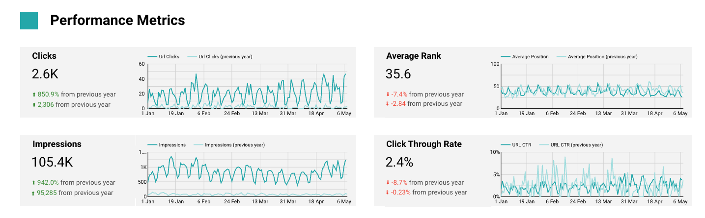
Different layouts for over time or period comparison
Typically the two big use cases are either:
- Analyses the site overtime and see how traffic breaks down
- Compare against another period to understand a change
We’ve got a separate page for both.
You can see how the quick summaries changes layout depending on what you want to accomplish:
Over Time
Period Comparison
Break apart average rank into more useful metrics
Average rank is great, but it can easily mislead you.
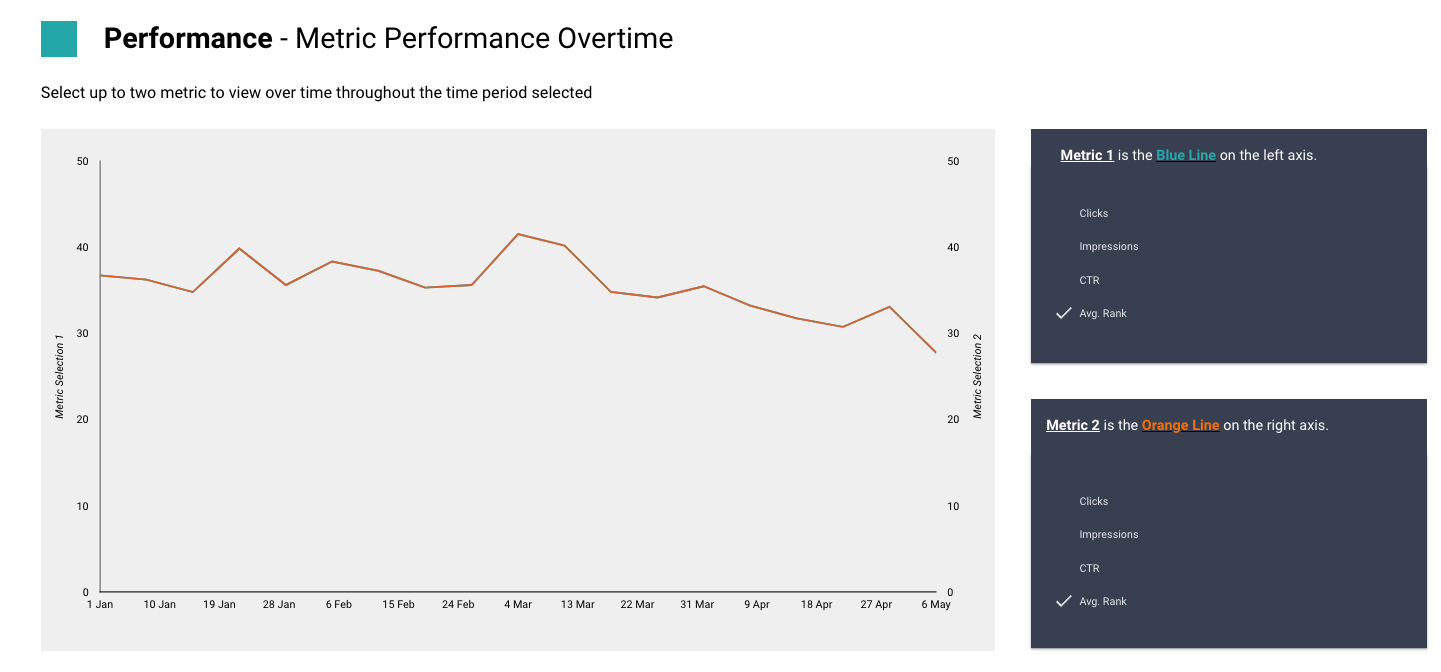
Are we ranking better here? What exactly is happening?
We allow you to look at a bucketed count of keywords in different positions to better understand how positions are moving under average rank.
![]()
Understand which dimensions are driving your traffic?
- Do you get more clicks on desktop or country?
- Which country is driving impressions and has it changed soon?
We let you dig through whichever dimensions are useful to see here.
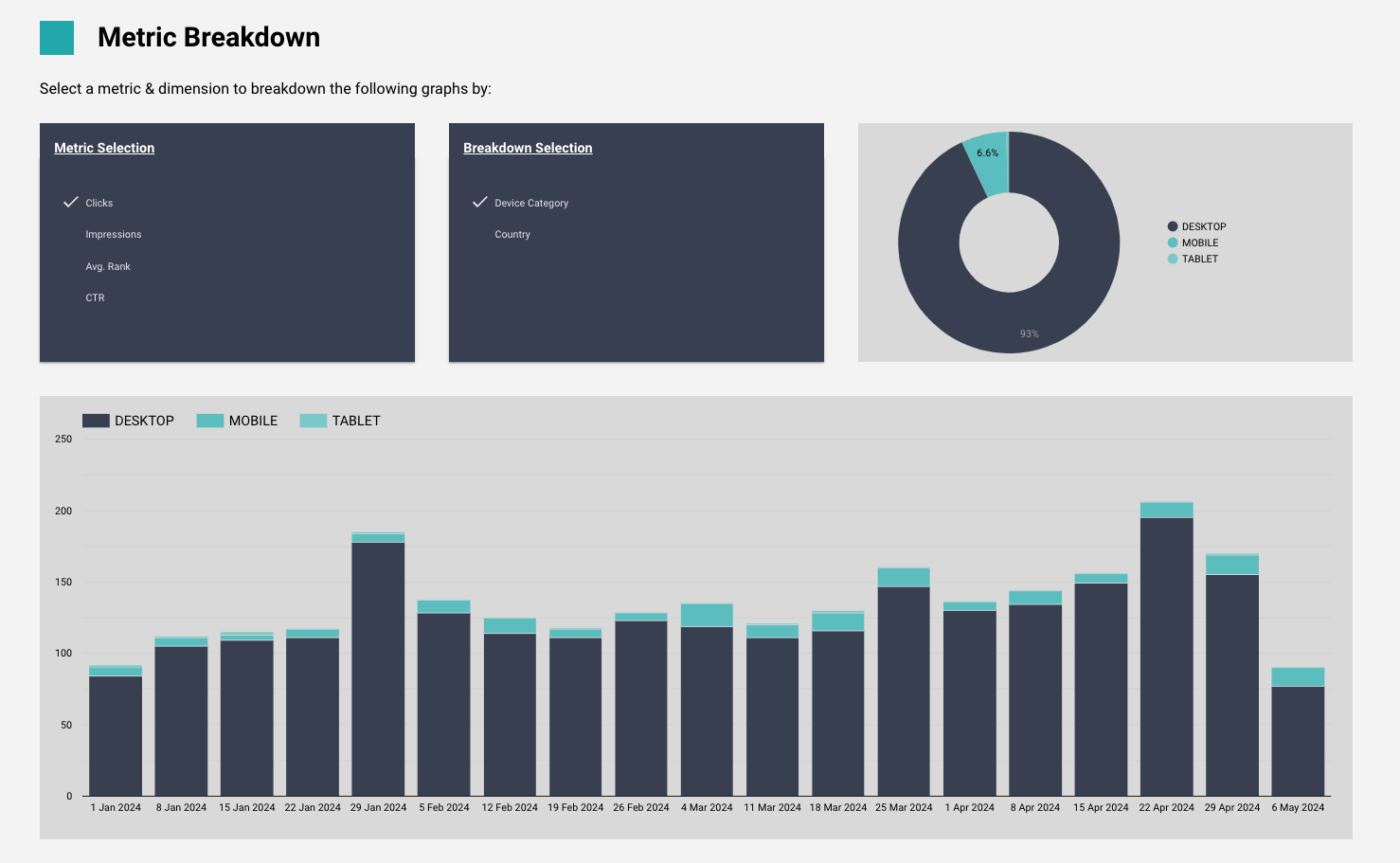
Find the quick winners and losers
We’ve got an entire page to show you the winners and losers of your clicks and impressions in the past 28 days.
We’ve pulled the two most important fields (clicks and ranks) upfront, although you can scroll to get impressions and CTR.
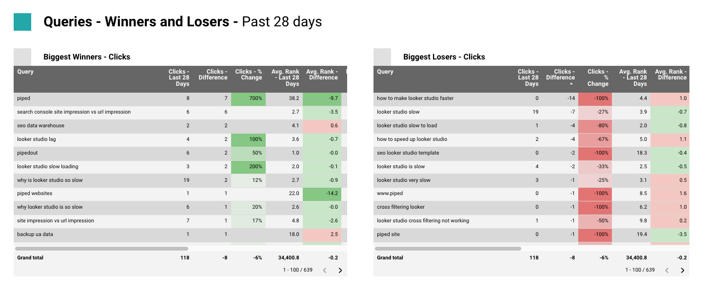
And we’ve used %’s to more helpfully highlight issues.
As well as breakdowns. You should of course consider adding more categories and breakdowns that are applicable for yourself.
Track against targets
If you don’t care about targets then delete this page and move on.
But if you’ve given targets or set them, then we can use a Google Sheet to set targets for our organic performance.
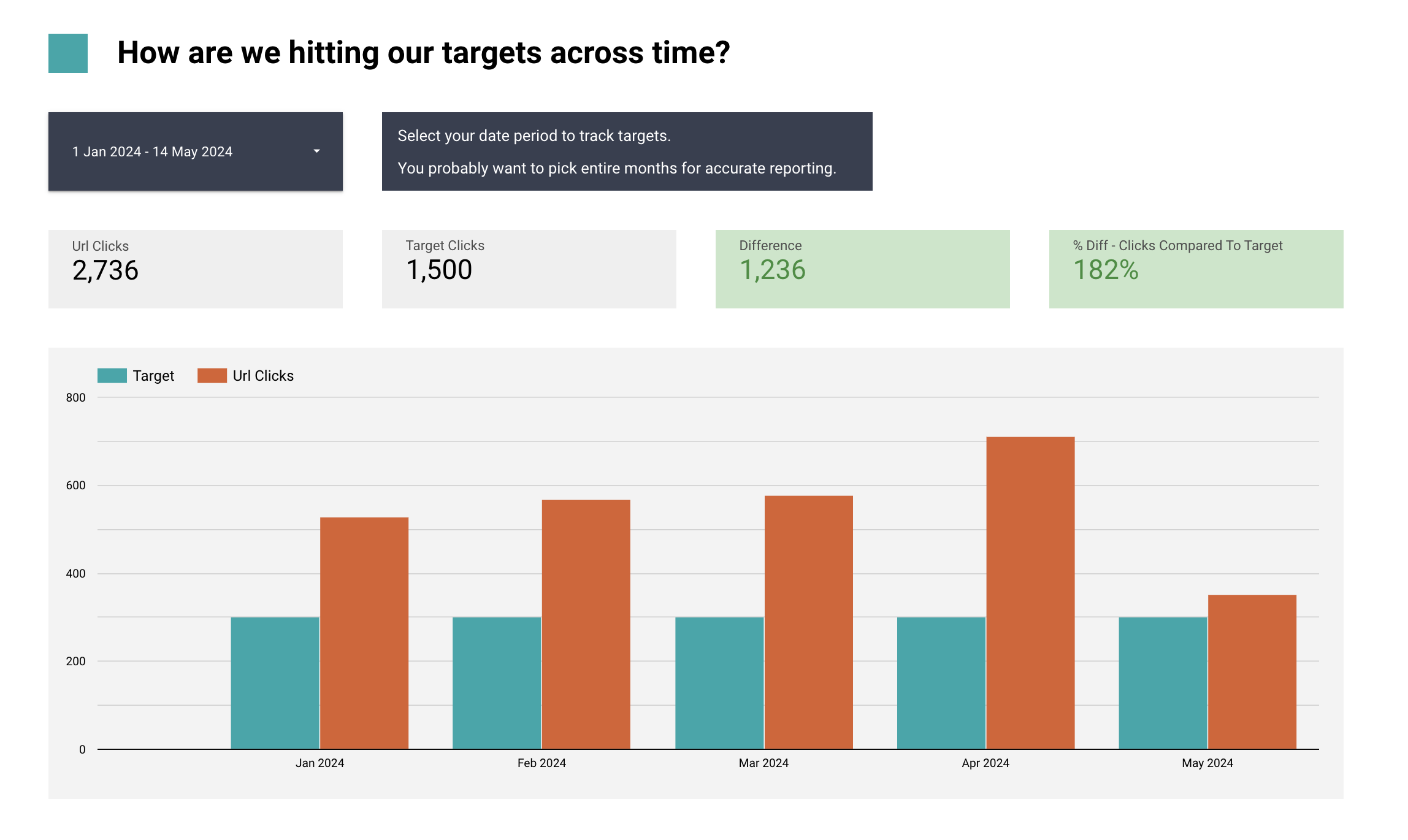
It’s relatively basic, we can only point to overall click numbers per country but it’s enough to get you started!
Google Analytics Report
More than just clicks!
Now we’ve got GA in the game we can get more than just clicks
We’ve now got revenue (and whatever other conversion metrics you might want, leads, newsletter signups etc). available to us.
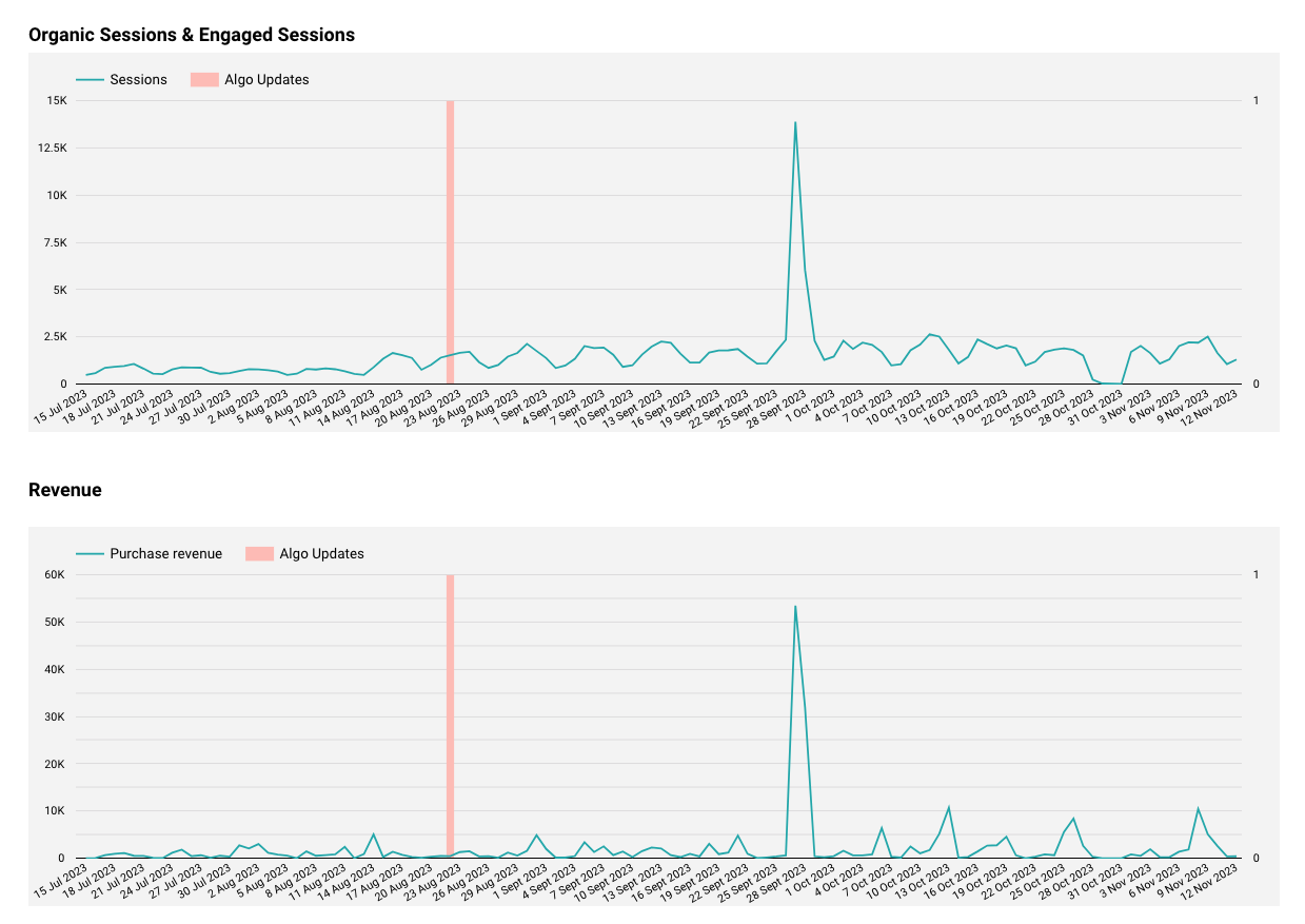
We’ve also got Google Updates
We added a Google sheet onto this one which shows us the latest Google updates and shows them on the graph.
You’ll probably want to pick the ones which are most relevant to you and you might also want to end changing the dates if there was a particular day in the core rollout which hit you.
Where did our traffic & conversion change happen?
To help you understand how changes in organic traffic and conversions moved together, we’ve got a period comparison page which lets you easily examine the breakdown of traffic across all the different dimensions.
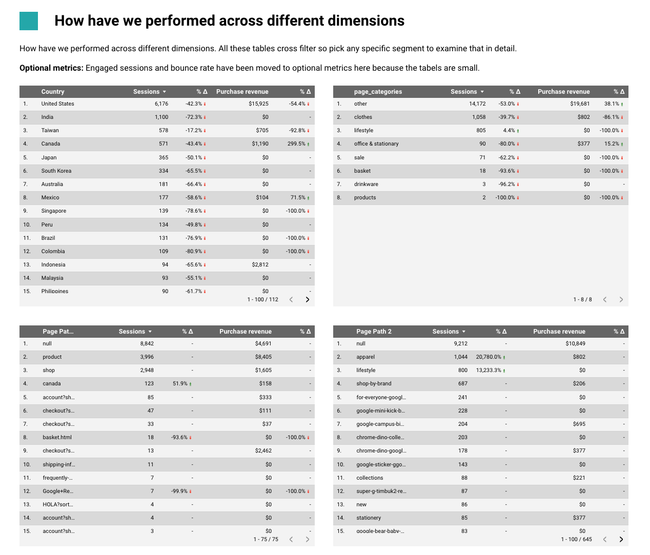
So we can see which country is the change happening, which page categories, which page paths and you can drill down by clicking into any of the tables to filter it further.
And plenty more
There are plenty of other nice little features in the dashboards.
Again you can find them in our free Resource Library.
Do you still want more from your dashboards?
Was this a big step up for your reporting? Do you want more? We can help you get better insight.
To show you what’s possible you can see an example of our reports over here and we’ve made a direct comparison for our Search Console report with a data warehouse here to show you how more things are possible.
- Revenue/conversions
- More than 16 months data
- More advanced segments like "pages which drive 50/80/90% of revenue/traffic"
- Faster dashboard
- 3 - 4 times more SC data.
- Better period comparison control
- Better metrics for examining the data.
And there are plenty other features not shown on this dashboard.
- Resetting content to publish date
- Weighted sorts
- Joining across more data segments like logs, ads etc.
If you're interested in getting more out of your reporting and data please get in touch.